











Campbell’s Soup Debuts First Can Redesign in 50 Years
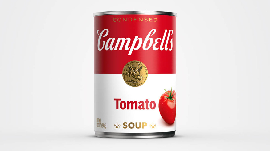
New label, same M'm! M'm! Good!® taste you know and love.❤️Look for our new design on shelves & online!#NewLook #Campbells #MmMmGood pic.twitter.com/h1tb6FRJrJ
— Campbell's (@Campbells) July 27, 2021
Campbell’s Soup recently announced a brand new redesign of their iconic can — the first in the last 50 years. The update will feature a few subtle changes, though with hopes to “modernize” the look of the label.
The new cans will feature a more contemporary look, with modernized stylings in the way of a new font that’s based on founder Joseph Campbell’s signature. In a fun little fact, Campbell’s noted the new label’s “hidden elements,” which employ another script-styled “C” within the fleur de lis designs, and slightly tilted “O” (in the word “soup”) to acknowledge past designs.
To help promote the new can redesign, Campbell’s also linked up with New York artist Sophia Chang to create the brand’s first-ever non-fungible tokens (NFT) to raise money for Feeding America. The NFTs went for sale earlier this week, though another animated NFT is currently still up for auction through August 6.