Pizza Hut’s New Logo Proves You Don’t Need To Reinvent The Wheel—Just Polish It
There’s been a lot of talk about logos recently, particularly surrounding Cracker Barrel’s rebranding debacle. To be fair, logo design isn’t easy. It requires understanding what makes a brand what it is, and how that brand connects to the current cultural zeitgeist.
That’s the technical, industry perspective, at least. From the consumer’s POV, all we care about is, “Does it look good?” And, in the case of Cracker Barrel’s short-lived logo redesign, it did not.
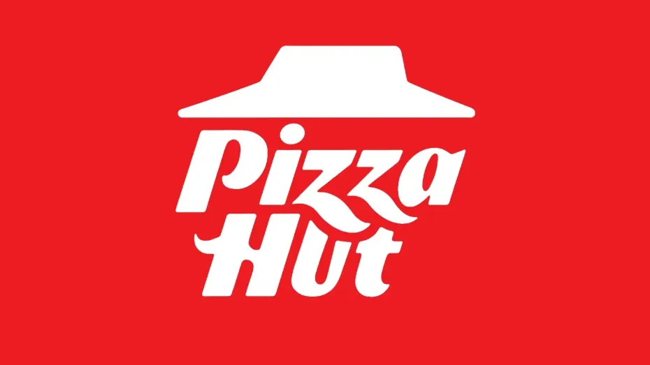
If that’s an example of bad logo redesign, the new Pizza Hut logo is a masterclass in branding. Unlike the former, which stripped away many of the elements fans associate with Cracker Barrel, Pizza Hut’s new logo retains the two most important elements: the hut roof and red color—all while adding a little flair to the previous iteration.
The company’s previous logo, which was originally created in 1974 and reintroduced in 2019, is one of the most popular designs associated with the brand. The new one looks similar but has subtle changes that make it pop more.
It’s a red box logo, reminiscent of the clothing brand Supreme—but with a white hut instead of red, and white lettering replacing black. The classic font remains, now italicized alongside the hut roof, adding a sense of playfulness, excitement, and movement. There are also subtle flourishes in the Z’s, which swoop down and curve into the U and T below. A color flip of the new logo with all red lettering was also previewed.
Pizza Hut’s new logo perfectly blends nostalgia with a modern edge—a redesign that looks just as good on a pizza box as it does on a billboard. This is how you do a logo refresh right.


