New Wonderbread Logo
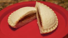
In order to re-establish a cohesiveness in their design and branding, the well known American brand Wonder Bread has undergone an interesting redesign at the hand of Kansas City-based Willoughby Design. The new design marks a more “grown up” typeface and more obstructed circle shapes floating above the textual half of the logo. Of course, with any amount of change amidst an entity as widespread and recognized as Wonder, there are bound to be criticisms. Many wonder if the design is even complimentary of the brand and its products, and if in fact the newly redesigned logo actually detracts, rather than garnering more appeal, for the company. Regardless of these criticisms, the new branding is making its way to over sixty varieties of bread, buns and dinner roll products. Give me some peanut butter and jelly, it’s time to eat on!

