


How Color Can Be Used To Affect Your Perception Of Food
From the beginning of time, color has always been something that has drawn us to particular foods. Nowadays, that attractiveness has evolved into expecting certain hues, brightnesses, and varieties when we select fresh produce from the grocery store or order food off of a restaurant’s menu. We want to see the food before we select it, because we make many judgments about whether food will taste delicious or not based on how it looks. It’s why chefs emphasize presentation in restaurants.
To help make food appealing to our eyes, chefs and grocery stores have developed methods and tricks thanks to technology, patterns, or varieties. Here’s just a few of the ones you may have (or have not) noticed that help you pick what you believe to be the perfect steak, juiciest orange, and a whole host of other food options.
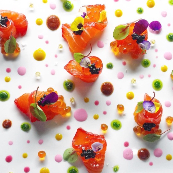
Bright White Backdrops
Whenever you go to an upscale dining establishment, there’s a good chance your meal is going to be served on a bright white plate. That’s done on purpose, as white serves as the perfect backdrop to every other color out there. As acclaimed New York chef Charlie Palmer told Today, “When you use a bright white plate, the food really stands out, its colors seem more vibrant, and it makes the food more appealing. It seems simple, but it’s true!”
Strengthening An Orange’s Sheen
You may be accustomed to seeing vibrant, deep orange hues on this classic citrus, but that’s not always the case originally. Oranges from Florida, from example, tend to be noticeably paler, especially earlier on in the harvesting season for these popular fruits. As a result, the FDA has allowed a specific dye called Citrus Red no. 2 to be sprayed onto these oranges to give them their more characteristic shade of orange. This dye is a potential cancer-causing compound (at least, according to the state of California), so it’s best to toss the peels out. But the fruit inside is safe and delicious, and if you’re eating it, Citrus Red no. 2 has done its job of getting you to select perfectly wholesome oranges that just don’t look as bright.
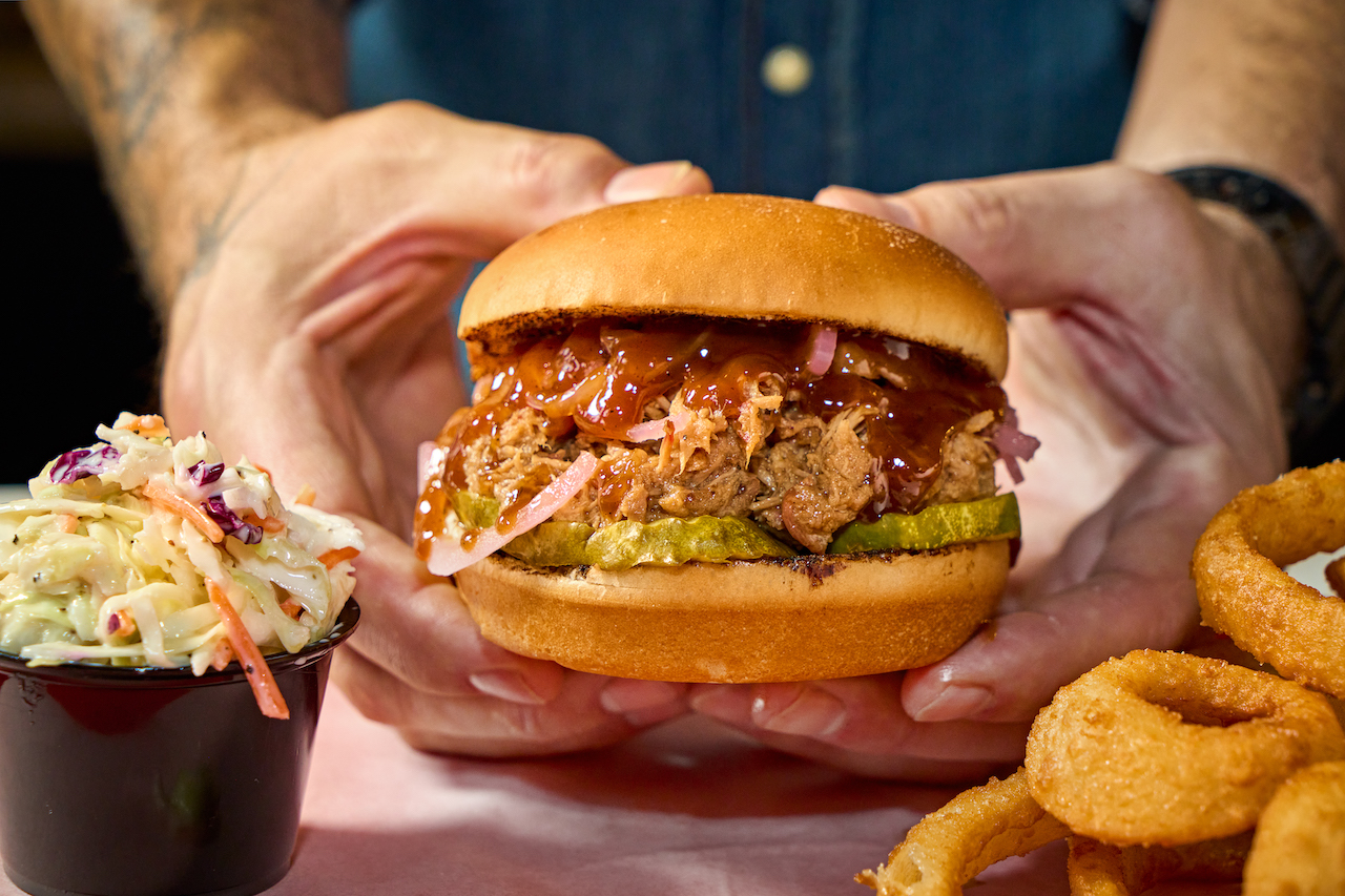
Contrast On The Plate
When plating food, it’s important to play around with colors. Utilizing sharp contrasting, or nearly opposite shades to enhance a plate could help make it look way more delicious. A bright orange sauce, for example, could coat a piece of cooked meat and be surrounded with a dark green, with the orange and green colors playing off of each other perfectly. It creates a visual balance on the plate that helps your eyes draw to each part of the dish better and prepare for every exciting burst of flavor you’re about to consume.
What A Package’s Color Says About Its Food
Did you know that the food industry uses different colors to evoke specific emotions with their food packaging? Sounds crazy, but think about how you feel the next time you look at a box of food colored with a certain hue. Blue-packaged products like OREOs and Kraft Mac and cheese, for example, are designed to be a memorable product because they were the colors originally used to market to children. Green packages represent health and naturalness of the food inside, and yellow should make you feel happier when looking at it. Don’t believe me? Experiment for yourself and see how you feel next time you’re at the store.
The Redness Of Steaks
In the United States, we love to see steaks that are a bright red color, as that is believed to be indicative of the optimum freshness and taste. Grocery stores have caught onto this, and have actually developed a couple of methods to accentuate the redness of their steaks. While one of these methods, spraying steaks with carbon monoxide, has been banned in the US, we can still shine red lights over meat to bring out their red color. Pretty crazy, right?
Show Off Your Caramelized and Cooked Sides
You know how steaks and other meats are typically served in a “fan” pattern on a plate, with slices overlapping each other? That method has been developed specifically to show you the two parts of the meat you’re going to critique the most with your eyes instantly: the sear and how well it’s cooked on the inside. The perfect medium-rare steak, for example, has a deep brown crust on the outside, but a luscious pink on the inside that’ll leave your mouth watering. When both are visibly present at once, you can envision the crunch and caramelized flavors of the sear with the juiciness and flavor bursting from the center of the steak the best, whetting your appetite for the delectable gourmet treat just set in front of you. This works for pork and chicken as well, with the only difference being that you want a moist white interior for those meats. Master the cook and the cut, and you’ll be well on your way to serving up fine-dining quality proteins.
Turning Poorly Marbled Steaks Into Works of Art
One of the best visual quality parameters of a steak is its marbling, or the streaks of white fat that run through the raw piece of meat. Fat translates to flavor, so the more of those you see, the better the steak will be. Some meats of a lower quality don’t have as much marbling, so to help make them look more flavorsome, a technique called artificial marbling is used. Hot, melted fat is injected into freshly butchered meat that then runs throughout the entire cut, creating some additional marbling effects that make meat fattier than it actually was to start with. This kind of meat has to be marked as such on grocery store labels, so if you’re interested in seeing what this looks like compared to other steaks of the same caliber, pick one up and experience it for yourself.