


Papa Johns is Getting a Brand and Store Redesign
New details have just emerged for Papa Johns’ new strategy for growth via a store redesign, new brand identity, and new logo.
Papa Johns is riding the momentum of recent turnaround in its business, seeing success to the tune of total company revenues increasing by 8.4%, to $512.8 million, in Q3, and comparable sales being up 6.9% in North American and 8.3% internationally, according to a press release.
Highlights of the rebranding include:
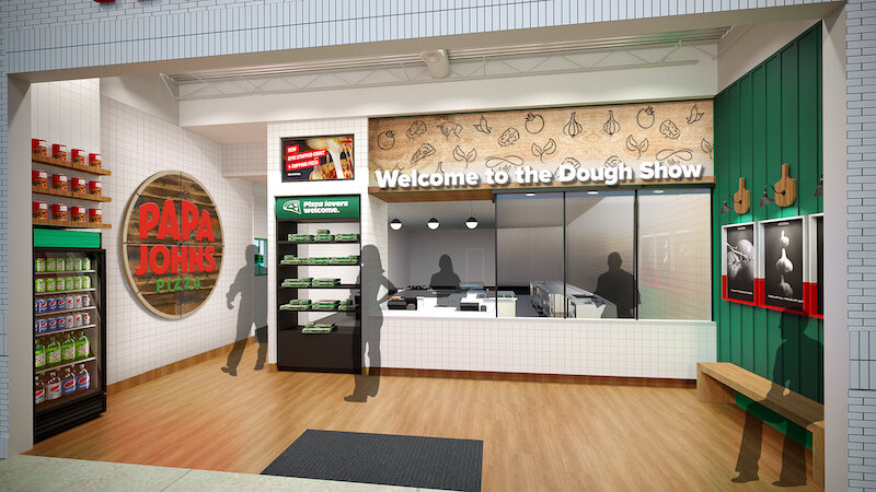
- Customer-Centric Restaurant Design: Papa Johns’ new modern, streamlined and flexible environment will provide seamless purchasing and pick-up experiences for customers.
- Logo: Bold, simple, fun and clean, this “Better by Design” logo features updated hues of Papa Johns signature red and green color.
- Brand Visual Identity: Papa Johns new visual identity draws inspiration from the premium ingredients it is known for and is brought to life through colors like Tangy tomato (red), Fresh basil (green), Fluffy dough (off-white), a custom typography, photos and illustrations.
In order to bring this new Papa Johns branding to fruition, a phased approach will be implemented gradually to roll out this new experience to customers and employees.