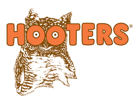
After serving up their vintage logo (below) for 30 years, Hooters has decided it's time for a change. The go-to American institution for buffalo wings and "pleasant conversation" is giving their scruffy ol' old owl the boot for a younger, more dapper Hootie.
Atlanta design firm Sky Design, revamped the logo and created a modern, sleeker look. But don't worry guys and gals, the double entendre is still there. "We want to keep the tongue-in-cheek wink going," says Dave Henninger, chief marketing officer.
Of course, the move was not one Hooters took lightly. After presenting various owl designs to 300 consumers, roughly 9 to 10 preferred the new logo to the old one. In the next few months, we can expect to see the new logo appearing everywhere from menus to waitress uniforms.
According to USA Today, Hooters has been stagnant for the past decade as other "breastaurants," such as Twin Peaks and Tilted Kilt, have snatched up customers with menus and designs that appear to Millennials.
I'm guessing it's only a matter of time before nostalgic Hooters fans start repping "Bring Back Hootie!" shirts.
H/T USA Today


